
Blog
Welcome

Recent posts
SEARCH RESULTS FOR: Colour Correction
As our colour correction policy outlines, when you order Full Colour Service we colour-correct your images so as to optimise natural skin-tones and achieve consistency across all the images in the album. However, if you run Photoshop actions or add special effects/tones to your images and the desired effect differs from these guidelines, we'd ask that you leave a quick note on your order to let us know, so we don't undo the work you've done on them. It's easy to leave notes in Photojunction: - Add notes to specific apertures by right-clicking on an image and selecting the 'Add/Edit Aperture To View More >>

Here's my second handy hint about file management. Don't muck about with your hi res files outside Photojunction after they've been imported. The key words there are outside Photojunction. If you want to keep the software smiling, they're important. It means you need to think about when and how you copy image files, and when you are going to do your artwork. Here are three alternative scenarios, which all keep PJ happy if used properly: 1. Do art work on your images before importing them. This is so you can import one set of finished files without lots of extra images, sub-folders etc to confuse To View More >>
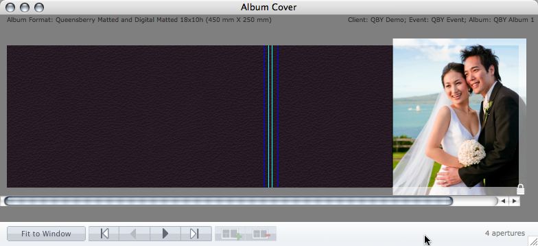
Cover layout design in PJ Remix Here are the first steps in preparing a perfect, hassle-free print-and-bind order, really fast. 1. First, upgrade to PJ Remix. If you have already, thank you. 2. Use Remix to design your cover as well as your page layouts. You'll get to frame and crop the cover image yourself, see exactly what it looks like and be sure that it looks good. For example, here you can see how much of the image in the photo front cover layout above has been cropped away. No problem in this case, but many images won't be suitable: 3. Export your cover AND page layouts using Remix's Export To View More >>
Hi all What an awesome privilege it's been to work with Queensberry to develop their Plug-in for Aperture 3! As a true blue Apple fanboy it's been a really exciting project to work on. When Apple came knocking we jumped at a chance to partner with them, but we've since had a few clients ask questions like: - What's the difference between Aperture 3 and Photojunction? - Why would you create a plug-in for Aperture when you already make Photojunction? ...And my personal favourite: - Does this mean Photojunction is dead!? We think your decision will ultimately be based on personal preference and To View More >>
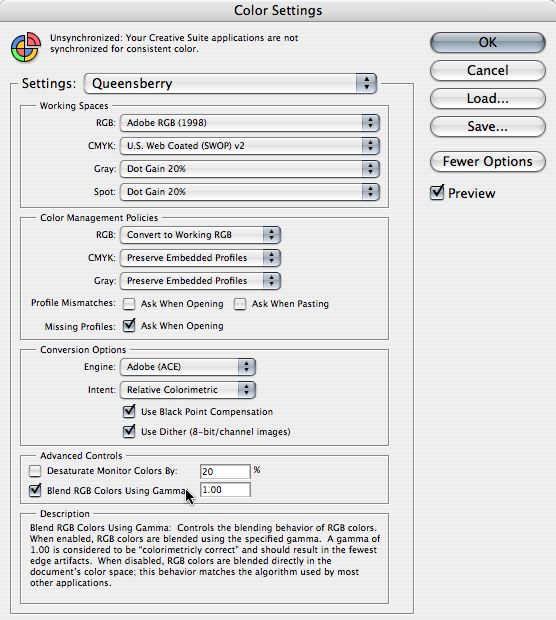
This is an important message if you send us layered PSD files. If any of the layers have reduced opacity what you see on screen may NOT match the print - unless you check an obscure preference box in Photoshop’s Colour Settings. In this post we'll tell you what to do about it, and why. In Color Settings’ Advanced Controls you should CHECK the box, “Blend RGB Colors Using Gamma” (as in the graphic). Leave the value set to 1.00. This is considered ‘colorimetrically correct’ by Adobe and will match our settings in the Lab. This check box affects the way that RGB colours are blended and To View More >>
Email: info@queensberry.com
Free Phone Numbers:
New Zealand: 0800 905 905
Australia: 1800 146 251
USA: +18668350851
UK: 0800 808 5271
Canada: +1 855 581 0370